The System
What it looks like
Visuals have been anonymised. Client and partner data has been redacted.
As the number of Strategic Key Accounts grew, so did the complexity of monitoring integration quality across the portfolio. Each partner's integration involves dozens of attributes, multiple page types, and various SDK configurations — and the data lived across different systems with no unified view.
Account managers had no way to quickly assess whether a partner's integration was healthy, which attributes were missing, or how adoption compared across the portfolio. Identifying gaps required manual data pulls, and by the time issues surfaced they had often been live for weeks.
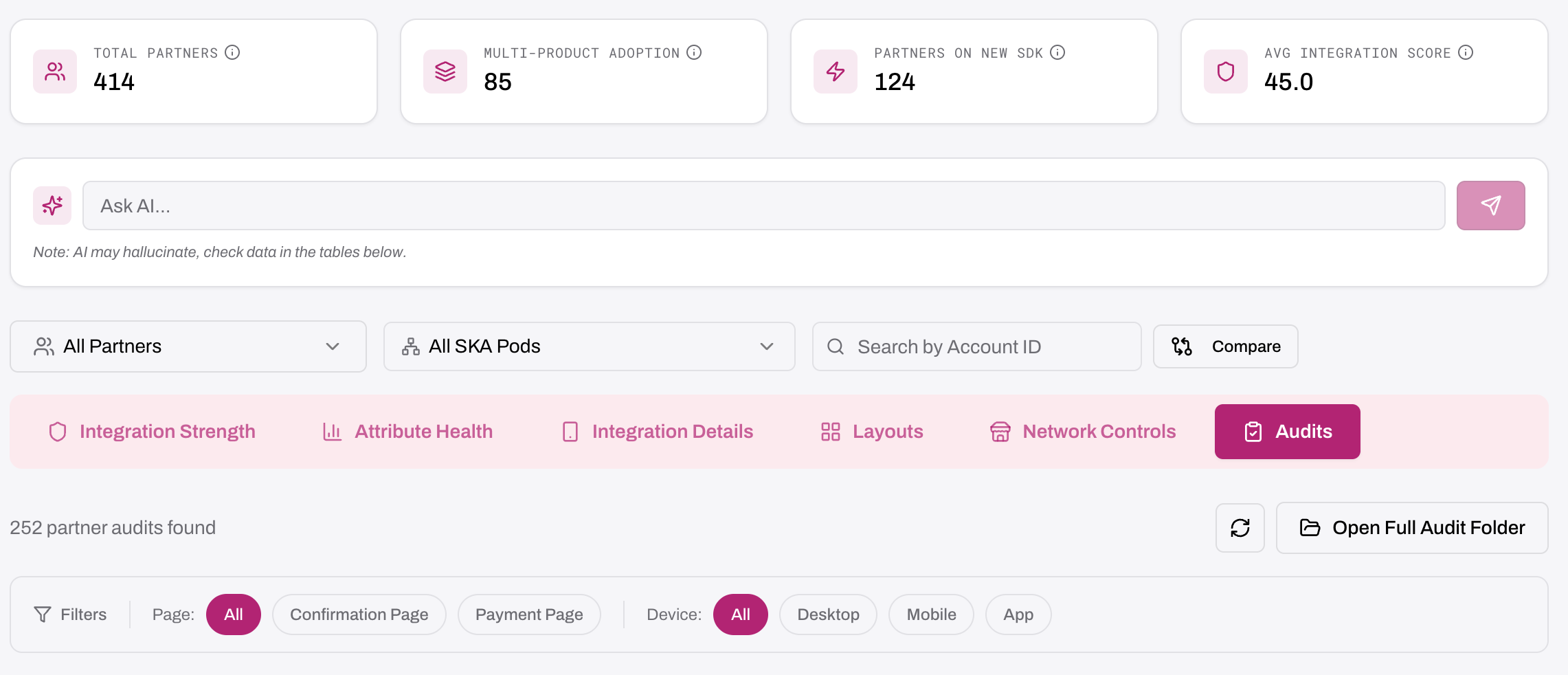
The team built a one-stop dashboard that scores every partner out of 100 based on Product Adoption (50 points) and Data Quality (50 points) — the only way to hit 100 is full multi-product adoption. The dashboard includes attribute health views showing fill rates for every attribute by partner and page, layout visibility across overlay, bottomsheet, embedded, and custom formats, and filters for partner, Account ID, page type, SDK version, integration type, and pod.
An AI chat interface lets the team ask natural-language questions like "What data does this partner integrate?" or "Compare Partner A's integration to Partner B's" and get answers grounded in real data — no manual queries or exports required.
Visuals have been anonymised. Client and partner data has been redacted.
The dashboard gave the GTM team instant visibility into integration quality across the entire portfolio. Gaps that previously took weeks to surface are now identified immediately. The scoring system created a shared language for integration health, and the AI chat interface means anyone on the team can get answers without waiting for a data pull.